The Best Paint Colors for Small Spaces
Small spaces often present a unique challenge when it comes to interior design. The size of a room is fixed, but the way it feels can be transformed through thoughtful color choices. Paint is one of the most accessible and effective tools for visually expanding a compact area. By understanding how different hues, finishes, and placement strategies interact with light, it becomes possible to create an impression of spaciousness without any structural changes.
Light and neutral colors are frequently recommended for small rooms because they reflect natural and artificial light rather than absorbing it. This reflection helps walls recede visually, making boundaries feel less confining. However, the specific shade, undertone, and sheen all play a role in how the final effect is perceived. A cool pale gray may behave differently from a warm off-white, and a matte finish can absorb light in ways a satin finish does not.
This article explores methods for selecting paint colors that can contribute to an open and airy atmosphere in small spaces. It covers the reasoning behind popular choices, the role of sheen, strategies for using accent walls, and practical considerations such as lighting and coordinating with adjoining rooms. The goal is to provide a framework for making informed decisions that align with individual preferences and room characteristics.
The Role of Light and Neutral Colors
Colors with high lightness values are known to reflect a larger percentage of the light that strikes them. This is why white, cream, light beige, pale gray, and soft pastels are common recommendations for small rooms. When a wall reflects more light, the space appears brighter and boundaries become less pronounced, which can help the room feel larger than it actually is.
Neutral tones also offer versatility. A light greige—a blend of gray and beige—can provide warmth without overwhelming a space. Cool neutrals, such as soft blue-grays, tend to recede optically, which may give an impression of depth. Warm neutrals, like creamy whites or taupes, create a cozy atmosphere while still maintaining a light footprint. The choice between warm and cool should take into account the room’s orientation and the quality of natural light it receives.
It is important to note that even light colors have undertones that can shift under different lighting conditions. A white that appears crisp in the store may look slightly pink or yellow on a north-facing wall. Testing samples on multiple walls and observing them at different times of day is a recommended step before committing to a full application.
Selecting the Right Paint Sheen
The finish of the paint affects not only durability but also how light interacts with the surface. Flat or matte sheens absorb light, which can reduce glare and hide minor imperfections. However, in a small space, this absorption may make walls feel more closed in. Eggshell and satin finishes offer a subtle reflectivity that bounces light around the room, contributing to a sense of openness without being overly glossy.
For ceilings, a flat white finish is often used because it diffuses light evenly and minimizes shadows. For trim and moldings, a semi-gloss or gloss sheen creates a contrast that draws the eye and adds definition. This contrast can actually make a room feel taller by emphasizing vertical lines. When selecting sheens, it helps to consider the level of natural light available. In a room with limited daylight, a satin finish on walls may help maximize the illumination from artificial sources.
Another aspect to consider is maintenance. Higher sheens are easier to clean but show surface irregularities more readily. In small spaces like bathrooms or kitchens, a satin or semi-gloss finish may be practical due to its moisture resistance. The final decision often involves balancing aesthetic goals with functional requirements.
Using Accent Walls to Add Depth
An accent wall is a single wall painted in a different color, usually darker or more saturated than the others. In small spaces, this technique can be used to create a focal point and add visual depth. For example, painting the far wall of a narrow room in a deeper shade can make the space appear longer, as the darker color recedes less dramatically than a light one.
When choosing an accent wall, the placement matters. Typically, the wall that naturally draws the eye—such as the one behind a bed or sofa—is a good candidate. The accent color should relate harmoniously to the surrounding neutrals. A deep charcoal, navy, or forest green can anchor a room without overwhelming it, provided the other walls remain light and reflective.
It is also possible to use accent walls to zone a small multifunctional room. For instance, a deeper hue behind a desk or reading nook can define the area without physical dividers. The key is to limit the accent to one surface; painting multiple walls in strong colors may reduce the sense of openness. Testing the accent color next to the primary wall color on sample boards can help visualize the contrast before painting.
Understanding Undertones and Lighting
Undertones are subtle hints of color that become apparent when a paint is placed next to others or viewed under certain light sources. A gray may lean blue, green, or violet; a beige may have pink, yellow, or green undertones. These undertones can dramatically change how a room feels. In a small space, mismatched undertones can create visual discord that makes the room feel smaller or less cohesive.
Natural light varies with orientation. North-facing rooms receive cool, diffuse light that can make warm neutrals appear flat. In such cases, choosing a neutral with warmer undertones may help balance the coolness. South-facing rooms have strong warm light, which can make cool tones appear stark; softer greiges or creamy whites often work well in these settings. East and west exposures bring shifting light that changes color appearance throughout the day.
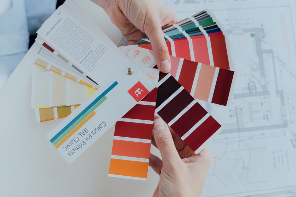
Light Reflectance Value (LRV) is a metric that indicates how much light a paint color reflects, ranging from 0 (black) to 100 (pure white). For small spaces, an LRV of 60 or higher is often recommended for walls, as these colors reflect a significant amount of light. However, personal preference and the specific ambiance desired also play a role. Home improvement professionals, including those at HandyFix, often suggest asking for sample cards and observing them in the actual room before purchasing full quantities.
Coordinating Small Spaces with Adjoining Rooms
In homes with open floor plans or connected rooms, the paint color in a small space does not exist in isolation. A small dining nook off a living area, for example, should relate to the larger room’s palette to create a seamless flow. Using a lighter version of the main living color in the small nook can maintain continuity while visually distinguishing the area.
Even in closed-off rooms, color coordination across hallways and adjacent spaces can affect the sense of scale. A sudden shift from a bright, neutral hallway to a very dark small room may feel jarring and make the room feel more cramped. Transitional shades—colors that bridge the two palettes—can help the eye move smoothly from one space to the next. HandyFix recommends considering the entire home’s color story when planning a small room, as this approach often yields a more unified and spacious overall impression.
Another strategy is to use the same white or light neutral on trim and ceilings throughout the main areas of the home. This consistency allows the eye to travel without interruption, which can make the boundaries between rooms feel less defined and the overall flow more expansive. The choice of trim color also influences how wall colors are perceived; bright white trim against a soft neutral wall can enhance contrast and add clarity to the space.
Practical Tips for Painting a Small Room
Preparation is an important part of achieving the desired outcome. Cleaning walls, filling holes, and applying a high-quality primer ensures that the paint adheres evenly and that the true color appears without interference from existing tones. For small spaces where every surface is visible, a uniform base is particularly helpful.
Painting the ceiling a lighter shade than the walls is a common technique to make a room feel taller. A flat white ceiling reflects light downward and draws the eye upward, contributing to a vertical sense of space. Similarly, painting the floor a light color or using light-colored rugs can support the overall airy effect. Small details such as matching the wall color to the ceiling or using a slightly lighter shade on the ceiling can further enhance the perception of height.
Finally, it is worthwhile to consider the furniture and décor that will occupy the room. Light colors on walls provide a neutral backdrop that allows furnishings to stand out. If the room is very small, using the same color family for both walls and large furniture pieces can minimize visual clutter. The goal is not to disguise the room’s size but to work with it through intentional color decisions that create a comfortable and visually pleasing environment.